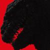
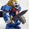
Ignoring the characters behind the figures, Deadpool's design is a bit... boring and generic. But then, Soundwave is a bit generic for a robot.
Looking at the figures for their merits in detail, and perhaps even quality, Soundwave is a winner. See those massive seams down Deapool's arms? YUCKY. I think I can see some seams on the inside of Soundwave's legs, but those aren't half as obvious as Deadpool's seams. Deadpool is also quite detail-free. No fabric creases, no interesting textures. Look at soundwave. Compared to Deadpool, that detailing is meticulous and extreme.
The poses are pretty similar, but look at Deadpool's boring colour-scheme! Then look at Soundwave! Is that SIX colours I spy? YOWZA.
I really hate the fat/cute style of the line Deadpool is in. It's just... I dunno. Too childish I guess. It's like they toned all the characters down to make them more family friendly. Why did they have to do that? Can't we just have mini superheros without resorting to chibi styling? They don't look right, especially anyone with an exposed face. At least the cute/fat style of Soundwave doesn't make him look like he's a 4 year old in a costume.
My final point can be found in this amusing picture.
 1247763950750.jpg 267.19K
10 downloads
1247763950750.jpg 267.19K
10 downloads
Soundwave is a clear winner.
Edited by Airot, 03 August 2009 - 05:01 PM.
I'll give you this strawberry if you keep it a secret.

 This topic is locked