 This topic is locked
I love everyones entry,I might not be able to vote.
Great Job Fellas,You went all out on this one.
I need to get me a LRG shirt.

I going with the vintage cotton it feels soft on my man skin.


Im a M.U.S.C.L.E head.


Posted 21 January 2008 - 08:46 PM


Aspiring Bigman/Handshake Enthusiast
Posted 21 January 2008 - 11:30 PM
I love everyones entry,I might not be able to vote.

ig: @itsgregstoys
Posted 22 January 2008 - 04:25 AM
ig: @itsgregstoys
Posted 22 January 2008 - 12:09 PM
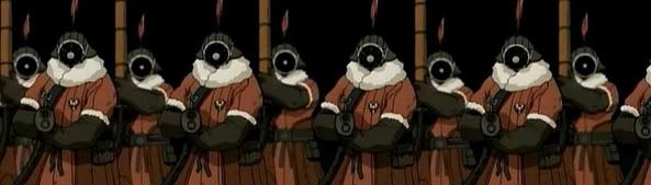
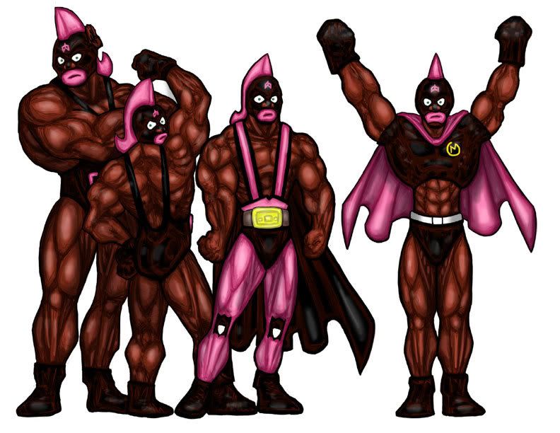
 terribull.jpg 516.8K
31 downloads
terribull.jpg 516.8K
31 downloads

Posted 22 January 2008 - 01:42 PM
Here is the winner. Really just stunning, even with the Cobra Commander pose.closer up on torso...
Aspiring Bigman/Handshake Enthusiast
Posted 22 January 2008 - 02:09 PM
Here is the winner. Really just stunning, even with the Cobra Commander pose.closer up on torso...
普遍的な主権者
Posted 22 January 2008 - 02:34 PM
Here is the winner. Really just stunning, even with the Cobra Commander pose.closer up on torso...
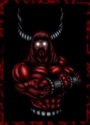
Well, he does get bonus points for finding a shirtless picture of Cobra Commander in the first place.
Y/S*N*T

Posted 22 January 2008 - 04:50 PM

普遍的な主権者
Posted 22 January 2008 - 07:26 PM
Y/S*N*T
Posted 23 January 2008 - 10:18 PM
Aspiring Bigman/Handshake Enthusiast
Posted 24 January 2008 - 12:03 AM
Toy Addict

Posted 24 January 2008 - 12:34 AM
No. I'm done.so is anyone working on another entry~?
Edited by Kevin Mayle, 24 January 2008 - 12:40 AM.
亢李 傻 操

Posted 24 January 2008 - 11:35 AM
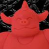
Buff1.GIF 42.07K
19 downloads
普遍的な主権者
Posted 24 January 2008 - 11:47 AM
Nathan
Posted 24 January 2008 - 03:59 PM
buffaloman.jpg 109.47K
26 downloads
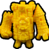
terribull.jpg 124.58K
21 downloadsMiracle Victory Power
Posted 25 January 2008 - 08:51 AM
No. I'm done.so is anyone working on another entry~?
Oh wait, I don't think anyone liked the one I did, so here's another one:
OK, now I'm done.
I just haven't been posting in too many of these FAC threads but I've been enjoying reading them 

Nathan
Posted 25 January 2008 - 09:25 AM
No. I'm done.so is anyone working on another entry~?
Oh wait, I don't think anyone liked the one I did, so here's another one:
OK, now I'm done.
I'm a big fan of your art and actually it was one of mf favourites of yours so far
@minifiguresXD
Posted 25 January 2008 - 09:45 AM
Sensing a disturbance in the force, I am.No. I'm done.
Oh wait, I don't think anyone liked the one I did, so here's another one:
OK, now I'm done.


Edited by Soupie, 25 January 2008 - 11:07 AM.

Y/S*N*T
Posted 25 January 2008 - 12:07 PM
Nathan
Posted 25 January 2008 - 02:22 PM


Y/S*N*T
Posted 25 January 2008 - 02:37 PM

Toy Addict
Posted 25 January 2008 - 03:26 PM
I'm back! And I brought my back with me!
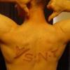
Posted 25 January 2008 - 08:52 PM
notanentry.jpg 89.7K
13 downloads
notanentry2.jpg 76.77K
14 downloads
pencil1.jpg 85.25K
14 downloads
Nathan
Posted 25 January 2008 - 08:52 PM
Toy Addict
Posted 26 January 2008 - 10:18 PM
Whoever hosts it should think of a Battle Beast theme because this month's was a MUSCLE theme.Have we even started talking about FAC 7? Who's going to be running it and what will the subject be?


 Copyright © 2024 LittleRubberGuys.com

