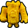

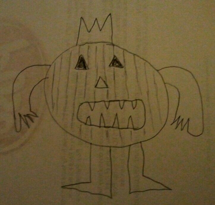
I don't think there was an OT connection or homage intended with the pumpkin guy. I think it's just a simple idea and image that appeals to a lot of people. I think it has over 40 votes now. It will also go down as the example that you don't have to be an artist to get an idea made in this line. Most people voting don't realize it was based on this:Some people seem to think the only submissions that matter are the "artist" submissions and that I don't get. For me there's a big difference between the 20 second drawings scribbled on folded paper and a drawing that obviously took some time and had thought put into it, though not necessarily from an "artist" and not necessarily perfect. It seems like there is kind of a haughty attitude among some like, "how dare you submit something if you're not an amazing artist!". That sucks the whole fun out of it for me. It becomes more of an art contest and less of a collaboration between like-minded people who want to make something fun and cool together (an initial idea that is not necessarily executed in an artistically amazing way can still be the basis of something really cool).
I do agree with Soupie that having both the logo dude and the pumpkin dude (assuming they both hold strong) is a bit much. I like the pumpkin because it is a more subtle homage--I can see there being a pumpkin guy even if there was no OT connection.
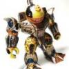
The logo figure is helped by being a finished sculpt that I think looks really good, and a lot of people are considering what they think "fits" OMFG when they vote. It's an obvious choice.