Attached Files
-
 banner.jpg 528.95K
13 downloads
banner.jpg 528.95K
13 downloads

Serious Collector

Posted 20 February 2007 - 05:34 AM
banner.jpg 528.95K
13 downloads
Serious Collector
Posted 20 February 2007 - 05:54 AM
BANNER.jpg 66.73K
23 downloads
Edited by Apricot, 20 February 2007 - 06:56 AM.
@minifiguresXD
Posted 20 February 2007 - 07:53 AM

Edited by Soupie, 20 February 2007 - 07:54 AM.
Serious Collector
Posted 20 February 2007 - 08:13 AM
I do love that banner, Apricot, but it just struck me that the names for each toy line are in Japanese, and therefore unreadable for most people, I'd guess.
Supertzar
Posted 20 February 2007 - 09:07 AM
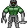
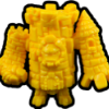
[b]Well, I lied. I updated my banner 2 more times.OK, here is my final entry. I feel it's my best one:
Here I added The Ultimate Muscle, Fire Wood & Water and KN pics as well as the words "Community Forum."

Squirrel

Posted 20 February 2007 - 12:28 PM
I do love that banner, Apricot, but it just struck me that the names for each toy line are in Japanese, and therefore unreadable for most people, I'd guess.
Serious Collector
Posted 20 February 2007 - 12:43 PM
I do love that banner, Apricot, but it just struck me that the names for each toy line are in Japanese, and therefore unreadable for most people, I'd guess.
I like the Japanese logos. Most people don't need to be able to read them. The fans know what they say and thats what counts.
I still think the text needs some work but I am a crabby old man who is never satisfied with anything. Bah humbug!
Squirrel
Posted 20 February 2007 - 01:16 PM
...
Posted 20 February 2007 - 01:34 PM
 [/WhiteLeo]
Serious Collector
Posted 20 February 2007 - 01:57 PM
AKIA Site Owner Y/S*N*T

Posted 20 February 2007 - 08:31 PM


 Copyright © 2024 LittleRubberGuys.com