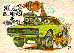
I think the differences are slight, but they are important. I think the "MUSCLE" text of yours is closer to the proportions of the real logo, while mine was a bit too vertically elongated. I also think you got a lot more of the angles of the explosions right.
On the other hand, I think you also missed a few other angles. The Millions of Unusual... text is too widely spaced, and the "MUSCLE" text, although closer than mine, still isn't quite right.
So, inspired by your improvements, I went back and tweaked mine a bit. Check it out below. I think the MUSCLE text is well-proportioned and the angles are better. Also, I noticed that the left-top part of the "M" is cut in a weird way on the Hauler, as is the right-top side of the "E", so I adjusted the logo to match.
By the way, the colors are so highly saturated because when you print it, it darkens the image a little bit. When it's printed, the colors should look authentic.


